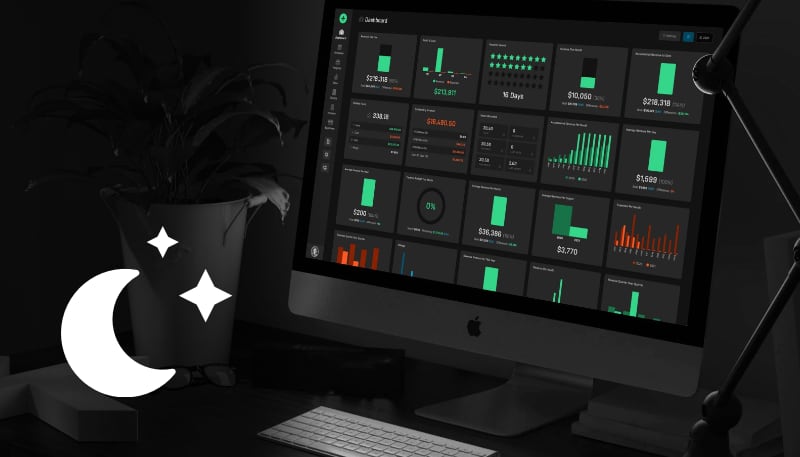
We're excited to reveal Harpoon's new Dark interface theme, along with a bonus theme we're calling Snow! Here's the full scoop:
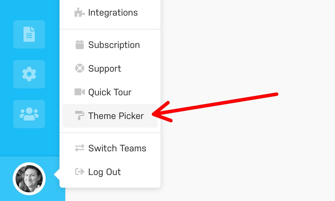
In your Account menu you'll find an option for Harpoon's new Theme Picker:
Selecting that option brings up the Theme Picker interface:
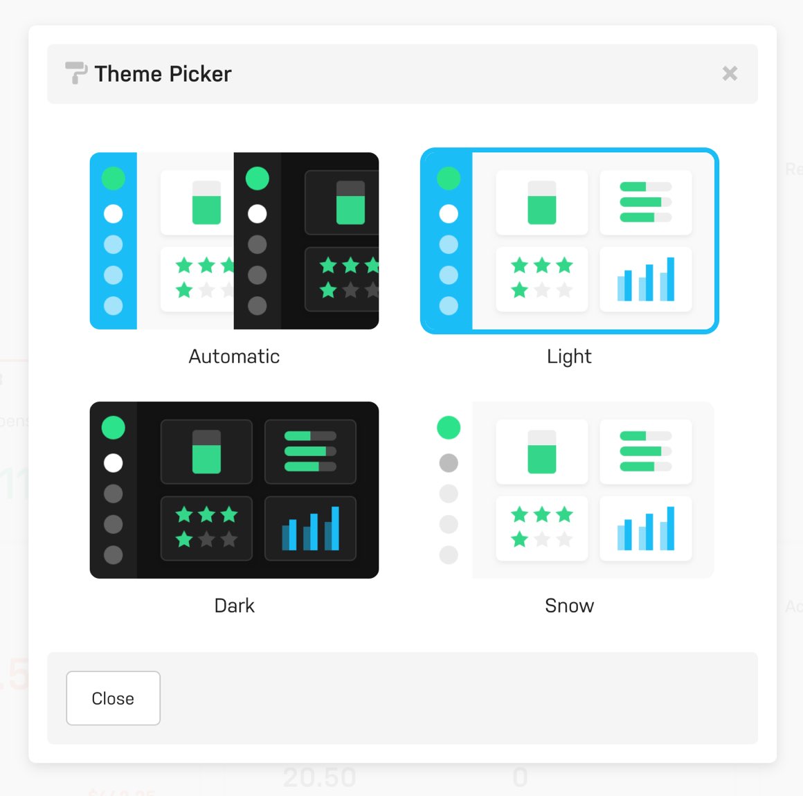
Here you can pick from some new theming options:
- Automatic – When this option is selected Harpoon will automatically match the appearance of your operating system (where supported). For example, if you're on a Mac and your Appearance system preference is set to "Dark" then Harpoon will automatically apply the Dark theme. It works with your operating system's "Auto" preference as well, automatically switching between Dark and Light themes based on the time of day.
- Light – This is the default theme you've come to know and love, which uses Harpoon's blue branding color for many of the interface's accents and highlights.
- Dark – The new kid on the block. Harpoon's Dark theme isn't simply an "inverse" of the Light theme. Not even. We carefully reconsidered the colors of every component, striking a careful balance between optimum legibility and just plain beautiful eye candy. The result is an interface that's easy to read during those late evening work sessions, yet so visually pleasing you might never turn it off.
- Snow – Our bonus theme, and my new personal favorite, Snow replaces most of Harpoon's blue branding accents with subtle shades of gray and white. If you do your best work in a minimalist environment then this is the theme for you.
From day one we've fought hard against the visually boring and stale corporate aesthetic reflected in so many other financial apps. So we're hoping these new theming options are one more way of helping our customers appreciate that finances can be beautiful (and fun)!
Have your own ideas or suggestions? Let us know!
